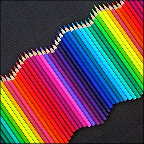
In art, rhythm can be created in many ways such as:
- Repeating a color/shape/texture/line/space
- Varying the size of objects, shapes or line in a sequence
- Using a progression of colors from tints to shades
 Proportion
This principle of design is related to comparing the size, shape and quantity of of the design. An example of that is how aligned or not aligned objects are.
Emphasis
Emphasis is the point of interest in the design. It is the area that attracts the eye first. You can create emphasis in your design by using contrasting colors, using unusual lines, making shapes excessively large or small, using a different shape, or using plain background space.
Balance
Balance is what gives the design stability. There is formal balance, which is like our bodies, both sides are identical. There is also radial balance, where the balance is from the center point, like a pizza or a daisy.
Unity
Another word to describe unity in the principles of design is harmony. Lines or shapes that repeat have a sense of unity. You want your design to be not too uniform but also not to have too much variety to where there is no unity.


No comments:
Post a Comment