Although this was my first time extensively using Photoshop, I learned a lot in the few class periods that we had. I had two specific tools that I thought were really cool in Photoshop.
The first one was the Magic Eraser Tool. When I first discovered it, I was so happy because it did a really good job of cropping objects almost perfectly. Because this was one of my first instances using Photoshop, my hand was not steady and I was not good at cropping out objects. This tool was super helpful and helped me learn how to crop objects on my own even better later on.
The second tool that I really liked was the Healing Brush Tool. Especially when I was editing pictures of myself, it was really neat to be able to edit my face and make those blemishes basically disappear. Even when it wasn't pictures of myself, editing blemishes on other people's faces was really cool. Although it was a little challenging at first because I had to get the hang of the tool, once I mastered it, I really liked it.
I know that I will be able to take what I learned this August Term and apply it to my fall IMED class, and that will be really beneficial.
Thursday, August 21, 2014
Thursday, August 14, 2014
Pictures that Represent Principles of Design
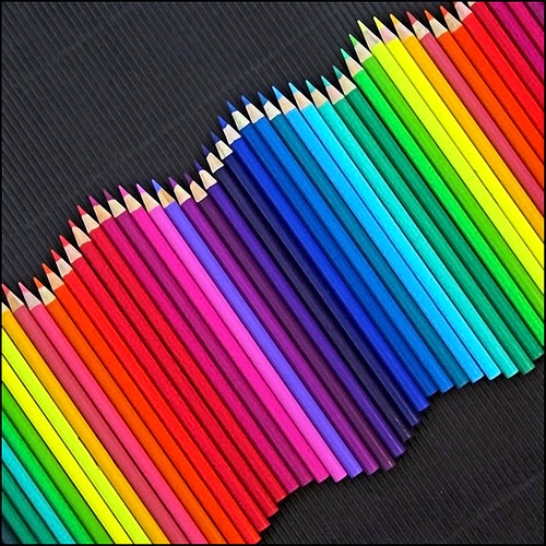
Rhythm
In art, rhythm can be created in many ways such as:
 Proportion
In art, rhythm can be created in many ways such as:
- Repeating a color/shape/texture/line/space
- Varying the size of objects, shapes or line in a sequence
- Using a progression of colors from tints to shades
 Proportion
This principle of design is related to comparing the size, shape and quantity of of the design. An example of that is how aligned or not aligned objects are.
Emphasis
Emphasis is the point of interest in the design. It is the area that attracts the eye first. You can create emphasis in your design by using contrasting colors, using unusual lines, making shapes excessively large or small, using a different shape, or using plain background space.
Balance
Balance is what gives the design stability. There is formal balance, which is like our bodies, both sides are identical. There is also radial balance, where the balance is from the center point, like a pizza or a daisy.
Unity
Another word to describe unity in the principles of design is harmony. Lines or shapes that repeat have a sense of unity. You want your design to be not too uniform but also not to have too much variety to where there is no unity.
Pictures that Represent Elements of Design
Line
This is one of the most basic elements of design, yet it can speak volumes. Different types of lines include horizontal, vertical, dotted, zig-zag, curved, straight, diagonal, bold or fine. Lines can communicate feelings, divide images, outline things and have many other functions in design.
This is one of the most basic elements of design, yet it can speak volumes. Different types of lines include horizontal, vertical, dotted, zig-zag, curved, straight, diagonal, bold or fine. Lines can communicate feelings, divide images, outline things and have many other functions in design.
Besides the fact that this image has lines in a location, this picture also shows space, which is another element of design that will be discussed later. The way the lines are gives you a feel for the depth of the tunnel as if you are actually standing inside.
Shape
Shape is an element we have all been learning about since we were young. Shape is simply the circles, squares, triangles we all know about. Shapes also include 3D shapes like balls and cubes.
This clip art shows 3D shapes. You can see cubes, rectangles and other different shapes in here.
Color
There are 3 words that are used to describe color.
- Hue- the name of the color
- Value-tells how light or dark the hue is
- Intensity-tells how bright or dull the hue is
Colors like the ones shown in this picture all have different hues, value and intensity. Although this is just powder, the picture is very vibrant and you can spot the different characteristics of color in it.
Texture
Texture is something that is very hard to portray on an electronic screen because it is how an object feels when you touch it. Although you cannot feel objects on your screen, some drawings are so intricate, that you can get an idea of how something feels just by looking at it.
Although you cant touch this picture and get a feel for the texture, you know its probably very soft and furry.
Space
The definition of space is the area that a shape or a form occupies. There is positive and negative space. Positive space is the filled space in the design, or the shapes that make up the design. Negative space is the background.
As you can see in the image above, that depending on your perspective of the picture, the positive and negative space is interchangeable.
Subscribe to:
Comments (Atom)


